My partner Christian has already described, in two detailed posts (part 1 and part 2), the backend architecture that powers this project: the data warehouse, the telemetry API, the metrics design. I am writing this as the complement to that : the frontend side of the same application, built in parallel, over the same weeks.
The project is the Renewable Asset Data Analytics platform, or RADA. The brief was to give energy asset operators a mobile-first dashboard for monitoring a heterogeneous fleet of batteries, solar farms, and wind turbines spread across multiple sites. Christian built the infrastructure that stores and serves the data. I built the interface that makes it readable : at a glance, on a phone, possibly while standing next to a turbine somewhere.
This article is a retrospective of that frontend build: the architectural decisions, the problems I ran into, and what I would do differently.
The brief and its constraints
The core requirement was straightforward to state and non-trivial to implement: visualise an entire fleet of assets simultaneously in a single, intuitive view, with enough visual encoding to let an operator identify at-risk assets instantly. Fault, curtailed, unreachable : these states needed to be legible at a glance, not buried in a table. The current proof of concept runs on 48 assets, but the frontend was built to scale beyond that number ; since it is entirely fed by the API rather than holding any hardcoded asset list, it should accommodate as many assets as the fleet actually contains.
Several constraints shaped the build from the start. The frontend and backend were developed by two people on separate repositories, which meant the API contract had to be negotiated explicitly and respected strictly. Christian's backend was also only reachable over Tailscale, a private mesh VPN, during development : it was never exposed publicly on the internet, only to machines connected to that private network. In practice, this meant my development machine had to be on the VPN for any API call to reach the backend at all, which added one more thing that could silently break a test session.
The styling constraints came from a decision I made myself: I designed the entire interface in Figma before writing a line of CSS, and every visual decision in the app traces back to that design file. I chose custom CSS over a utility framework like Tailwind because, given the level of customisation the design called for (the HSL token system, the dual themes, the specific bubble chart aesthetic) it felt easier to manage with full control over the cascade than to fight a utility-first approach into producing something that specific.
The stack
The framework choice was Next.js with the App Router. The key reason was pragmatic: Next.js API Routes give you server-side functions without standing up a separate Express server, which solved the API key problem neatly. The backend API key cannot appear in the browser bundle. With Next.js running on Vercel, the browser calls internal routes, the internal routes inject the key and call Christian's backend, and nothing sensitive is ever exposed on the client side. CORS became a non-issue as a consequence: server-to-server calls are not subject to it.
For visualisation, I used D3.js directly : no wrapper library. The main view is a bubble chart driven by a D3 force simulation, and that kind of layout requires fine-grained control over positions, physics, and rendering. Abstraction libraries like Victory or Nivo are well-suited to declarative chart types; a custom physics simulation is not one of them. For the historical charts in the stats modal, I used Recharts, which is much better suited to time-series line charts and integrates cleanly with React state.
Styling is handled by CSS Modules for component isolation and CSS custom properties for theming. All colours are defined as raw HSL component values at the token level and composed into semantic names at the usage level. This makes opacity variants trivial and dark mode a matter of overriding a small set of tokens on the <html> element. No runtime CSS-in-JS overhead, no separate theming library.
The fonts, Roboto Mono and Spectral, are self-hosted as .woff2 files loaded via @font-face in globals. No Google Fonts network requests: a GDPR consideration that also removes a small external dependency.
What the interface does
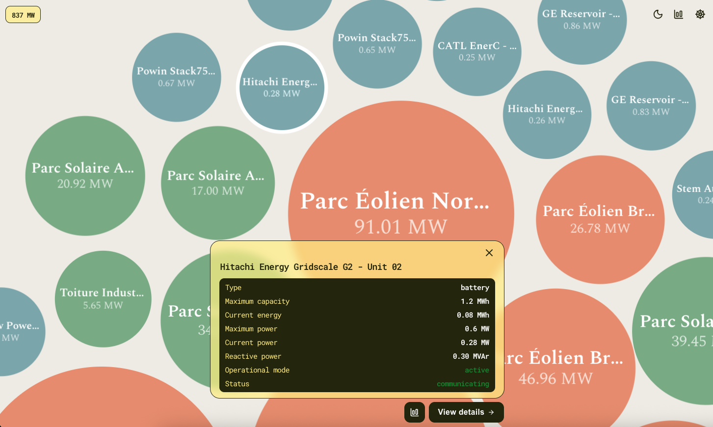
When an operator opens the app, they see the full fleet laid out as a field of bubbles. Each bubble represents one asset. Size encodes the asset's current charge or power output relative to others in the fleet. Colour encodes operational state: a muted palette for normal, a saturated indicator for anything that needs attention : fault, curtailed, unreachable. A fleet total power badge aggregates live output across the visible assets and updates as filters change.
Tapping a bubble opens a detail panel that slides up from the bottom of the screen: power, energy stored, voltage, current, temperature, operational mode, all for the selected asset at the current moment. From there, the operator can open a stats modal to plot any of those metrics over a configurable time range, and compare multiple assets on the same chart. The interface supports light and dark mode, switchable at runtime and persisted across sessions.
This description makes it sound clean. The implementation was not always.
The problems worth documenting
SVG text jitter on WebKit. The first version of the bubble chart rendered asset labels as SVG <text> elements inside the D3 simulation. On Safari and iOS Chrome, this produced a visible stutter: WebKit applies pixel-snapping to SVG text rendering, which causes sub-pixel position updates during the simulation to snap to integer coordinates. The fix was to replace SVG text with HTML div elements positioned via element.style.transform, updated directly inside the D3 tick callback. This bypasses both React's render cycle and WebKit's SVG renderer. The lesson is simple: if you are building a D3 force simulation that needs to run on iOS, do not use SVG text for animated labels. Test on a physical device from the first commit. Chrome DevTools mobile simulation does not reproduce this.
Bubble click dismissed immediately. Tapping a bubble opened the detail panel for a single frame before it closed again. The cause was event bubbling: the bubble's click event propagated up to the chart container's dismiss handler, which treated any click outside the panel as a dismissal intent. The fix was e.stopPropagation() on the bubble handler. The lesson is that any interactive element inside a "click outside to close" container needs to stop propagation, and that this is easy to miss when the click target is a D3-managed SVG node rather than a React component.
Timezone double-conversion. Historical chart X-axis ticks were showing times shifted by one or two hours. The root cause was a bucketing function that converted timestamps to Europe/Paris before aligning them to 10-minute slots, after which the display layer converted them again. Timezone bugs are almost always double-conversion bugs. The fix is not to convert more carefully; it is to convert exactly once, at the display boundary, and nowhere else. I centralised this in dateUtils.js, with separate functions for bucketing in UTC and formatting for display : the distinction is now explicit in the function names.
limit=N does not mean a fixed time window. This one was a negotiation rather than a bug. The backend's limit parameter applies variable downsampling depending on the asset's reporting frequency; a limit=288 on a 30-minute-resolution asset returns six days of data, not 24 hours. Once this was clear, I moved to always sending explicit from_ts and to_ts parameters for time-range queries. A shared OpenAPI spec at the start of the project would have surfaced this before either of us had written the first hook.
setState inside useEffect. Preserving the detail panel's content during its slide-out animation required keeping the last displayed asset visible while the panel was closing. The initial implementation used setState inside useEffect, which triggered ESLint warnings and risked render loops. The cleaner solution was derived state initialised directly in useState: the panel stores its own copy of the displayed asset, updated only when a new asset is selected, not on every render. The rule of thumb I took from this: useEffect is for side effects : fetches, DOM mutations, subscriptions. Not for state synchronisation.
What I would do differently
CSS Modules from the first component, not halfway through. Starting with inline styles and migrating later is twice the work. The migration backlog this created was avoidable.
Centralise date utilities before writing any date-handling code. dateUtils.js was created reactively after the first timezone bug. Starting with an explicit UTC-boundary module would have prevented that class of bug entirely.
Use key-based remount as the default reset strategy for modal-mounted components. The StatsModal accumulates internal state across opens; resetting it variable-by-variable in useEffect is fragile. Passing an incremented key to the inner chart component forces a clean remount and eliminates the whole problem. I arrived at this late. I would start there now.
State of the MVP
The proof of concept is deployed on Vercel and connected to Christian's production backend. The fleet dashboard, asset detail panel, historical stats, filtering, dark mode, and background polling are all functional. End-to-end testing has been done on a physical iPhone over Wi-Fi. The proxy architecture works correctly in production: no CORS issues, no API key visible in the browser bundle.
What is not yet built: real authentication (pending the backend endpoint), the natural language query interface that Christian's backend already exposes, the grid signal panel, and a few additional chart types pending agreement on which metrics are most operationally useful. These are deferred, not abandoned.
There is also a known limitation with the 10-minute bucketing: it produces occasional visible gaps for assets with reporting intervals of 30 minutes or longer on long time ranges. Worth monitoring in production.
It is worth being clear about what this proof of concept is actually for. This is not a personal tool built for our own convenience ; it is meant to become a free, open-source platform aimed at communities and operators who manage distributed renewable assets and currently have no affordable way to do so. The existing options in that space tend to be expensive, built for large utilities, and out of reach for a small operator managing a handful of solar panels, batteries, or turbines spread across a wide area. RADA is meant to close that gap.
That ambition shaped how I approached the interface. The two themes, the bilingual toggle, the level of polish in the design : none of this was strictly necessary for a working proof of concept, and I am aware of that. But if the goal is for this to be picked up and used by people outside the two of us, the interface needs to hold up on its own, without either of us standing behind it to explain how it works. A well-designed environment changes your daily relationship with a tool, and "good enough to prove the concept" is a lower bar than I was willing to settle for here.
Christian will be writing a third post covering the project roadmap : asset configuration, broader asset integrations, and the ML modules planned for forecasting and anomaly detection. What comes after this first iteration is a larger question than either of us can answer alone, but the foundations are in place, the dashboard is running, and the data is flowing where it should.
Online demo : https://rada-dashboard.vercel.app/
Github repository : https://github.com/Candyfair/rada-frontend